darkmode-rentablo

Why dark mode makes sense for financial products

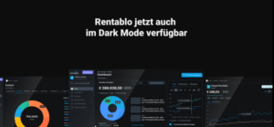
Exclusively for our customer Rentablo.de, we made a new function available in September 2024: dark mode. This is not just a trend, but also an important element for improving the user-friendliness of interfaces, especially in the financial sector and for products that are displayed on screens such as laptops or smartphones. In this article, we explain why dark mode is relevant and how it improves the user experience.

Analysis of the target group in the financial sector

An analysis of our customers' target group in the B2C sector revealed important facts:

  • Average age of financial decision-makers: in Germany it is 35 years, across Europe it is over 38 years.
  • Age distribution: 24 % of people who invest in financial products are between 38 and 48 years old, 15 % are younger than 28 and only 6 % are over 48.
  • Gender distribution: 86% of private financial investors are men.
  • Family status: 52% of all financial decision-makers are single, 48% are married. Individuals with children are generally more risk averse.

Based on this data, we have developed Dark Mode to provide a more intuitive, user-friendly interface tailored to the different needs of our users.

Dark Mode: Improved user-friendliness and convenience for digital apps thanks to...


Zugänglichkeit und Komfort für die Benutzer 1...Better accessibility
According to the World Health Organization, over 2.2 billion people worldwide suffer from visual impairments. In particular, color vision disorders affect more men (2-8%) than women (0.8%). Dark Mode improves readability for people with color blindness by providing strong contrast between text and background.


Reduzierung der Augenbelastung...Reduction of eye strain
Dark mode reduces the amount of light hitting the retina. This makes it easier to use for longer periods of time, especially in poor lighting conditions.


Darkmode-Energieeinsparung


...Energy saving
On OLED displays, dark mode saves energy because black pixels do not consume any energy. This significantly extends the battery life.


...Aesthetic and functional advantages
Dark mode is often associated with luxury and technical modernity. It is particularly suitable for highlighting visually appealing content such as graphics and diagrams.

How we designed the Dark Mode

Creating the Dark Mode required attention to detail. In dark interfaces, the perception of depth is conveyed through color gradients: The background remains the darkest element, while the user interface elements above it become lighter. This creates a natural sense of depth and helps the user to intuitively navigate the website. Our focus was also on:

  • High contrast design: we adhered to the minimum recommended contrast ratio of 7:1 as per W3C guidelines.
  • Avoiding distractions: Less saturated colors that meet the WCAG contrast ratio (4.5:1) and transparent elements provide a harmonious user interface.
  • Optimization of visual elements: Formats such as PNG, SVG and WEBP guarantee a clear display on all devices.

Dark mode - users decide individually

Customers are individuals and should therefore be able to (re)decide which mode they choose at any time. With a switch in the user interface, your customers can switch between light and dark mode at any time to choose the option that is most comfortable for them.

Conclusion

Dark mode is not just a fashionable feature. It is an essential element in improving the user experience, especially in light of increasing digital accessibility and individual user preferences. The use of dark mode improves the user experience and thus also increases customer loyalty. Taking the above research and statistics into account, our team has created a harmonious and user-friendly dark mode interface that attracts new users and makes our customers' products even more accessible.

Interested?

Write to us via our contact form or contact your wealthAPI sales agent.